

(In short)
- A brand identity system is the elements plus the rules for using them
- It covers logo system, colour, type, imagery, voice and guidelines
- The real test is whether your team can use it after the designer leaves.
The visible identity may be bold, but the decisions that hold it together are often subtle: hierarchy, constraints, naming, spacing, and thoughtful handoff.
The most visible part of a brand project is usually the reveal: the mark, the palette, the campaign image, the site in motion. What makes those pieces useful over time is less visible. It is the quiet work of deciding how information is organized, where variation is allowed, and how another person can use the system without the original designer in the room.
What is a brand identity system?
A brand identity system is the complete set of visual and verbal elements that define how a brand looks, sounds and behaves, together with the rules for using them. The logo is one part of it. The system is what lets a team that wasn't in the room produce work that still feels like the brand.
What a brand identity system includes
- Logo system: primary mark, secondary marks, lockups and clear-space rules
- Colour: a core palette with defined proportions and accessible contrast
- Typography: typefaces, hierarchy and sizes for screen and print
- Imagery: photography, illustration and graphic devices
- Voice: how the brand writes and speaks
- Guidelines and templates: the rules and ready-made files that make the system usable.
This work is not administrative cleanup after the creative idea. It is part of the idea. A system becomes believable when its smallest decisions support the same point of view as its loudest moments.
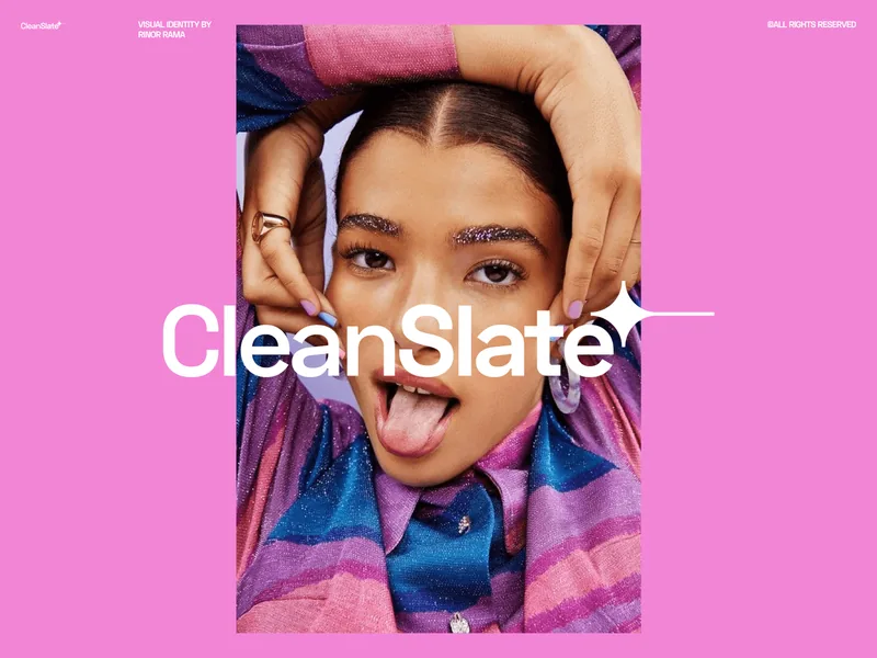
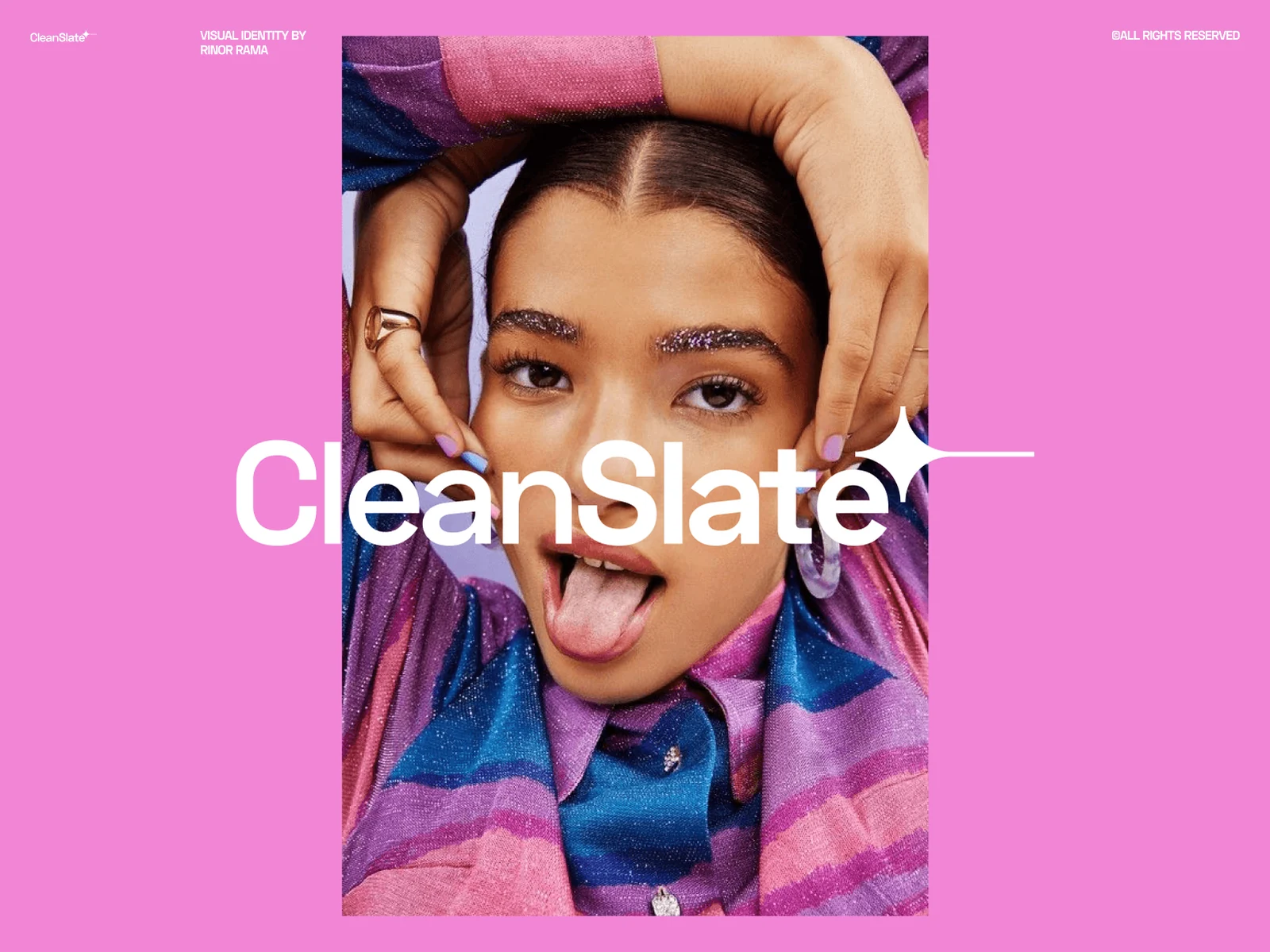
For a public example of a well-documented system, look at how Google's Material Design explains everything from colour to motion. See identity systems in practice in Cleanslate and Capri.
Clarity begins before the first visual
Before choosing type or color, it helps to define what the identity needs to make easier. Is the brand entering a crowded category? Does it need to explain a complex offer quickly? Should it feel established, experimental, direct, or warm? These are not mood-board labels. They are criteria that allow the team to judge ideas with more precision than simply liking or disliking them.
Clear criteria also protect the project from accumulating unnecessary concepts. When every visual decision can be connected to a real communication need, the identity becomes more focused. The result may look effortless, but that ease is produced by removing choices that do not serve the core direction.
A system feels simple when the difficult decisions have already been made.
Constraints create a recognizable voice
A useful constraint is not a limitation placed on creativity. It is a boundary that gives creativity a shape. Restricting the number of type sizes can make hierarchy more confident. Defining one image treatment can make varied photography feel connected. Establishing a consistent pace between dense and open layouts can create a rhythm people recognize before they notice the logo.
The important question is whether the constraint produces meaningful behavior. Rules copied from another identity may create order, but they will not create character. The most effective constraints grow from the brand’s message, audience, and working reality.
The handoff is part of the design
A system is only complete when someone else can make good decisions with it. That requires more than exporting assets. File names, component logic, examples, templates, and short explanations all influence how faithfully the identity will be carried forward. A beautiful guideline that is difficult to navigate will be used less than a clear one that answers practical questions quickly.
The goal of a handoff is not to control every future outcome. It is to transfer judgment. When people understand what each rule is trying to achieve, they can extend the system rather than merely repeat it. That is the quiet point where a design project becomes a durable brand tool.
Designing identities that hold up everywhere is the core of my brand identity design work.
Planning one? Read what a brand identity costs and how to brief a designer before you start.

Rinor Rama — independent brand designer and creative director in New York with 13+ years of experience. Collaborations include Nike, Microsoft, Google, Brent Faiyaz and Don Toliver.Behance · Dribbble · LinkedIn
(Related work)
Seen in practice.





Tell me what you're building — I'd love to help.
Rinor RamaBrand designer & creative director
Contact