
(In short)
- Good interfaces start with the decision the user needs to make
- Motion should explain change, not decorate
- The brand should shape behaviour, not just colour.
The best digital experiences do not remove personality. They remove hesitation, then use personality to make the clear path memorable.
A good interface often feels obvious after it exists. The next action appears where it is needed. The hierarchy seems natural. The page gives enough information without feeling crowded. That sense of inevitability is not the absence of design; it is the result of many design decisions agreeing with one another.
Core UI design principles
- Clarity: every screen has one obvious next step
- Hierarchy: size, weight and position show what matters first
- Consistency: the same action looks and behaves the same everywhere
- Feedback: every action gets a visible response
- Restraint: motion and decoration only where they help someone understand
- Personality: the visual identity shapes behaviour, not just colour.
Clarity is sometimes mistaken for neutrality. In practice, clear interfaces can carry a strong visual voice. The difference is that personality supports the journey instead of competing with it. Type, motion, and composition help people understand what matters, where they are, and what happens next.
They overlap with Jakob Nielsen's 10 usability heuristics, still one of the most widely used checklists in interface design.
Begin with the decision, not the screen
Screens are containers for decisions. Before arranging components, identify the decision a person is trying to make at each stage. On a portfolio, it may be whether to explore a project. On a product page, it may be whether the offer fits a need. On a form, it may be whether the effort feels worth the outcome. A useful layout gives the most space and contrast to the information that helps with that decision.
This perspective prevents a common problem: pages that are visually balanced but behaviorally unclear. Equal emphasis can look tidy while forcing the visitor to do extra work. Hierarchy is a form of guidance. It communicates priority before a single sentence is read.
An interface feels intuitive when its visual order matches the visitor’s mental order.
UI animation: use motion to explain change
Motion is most valuable when it connects two states. A panel that expands from its trigger, an image that follows a selected project, or a transition that preserves spatial context can make an interaction easier to understand. The animation becomes an explanation of what changed and why.
Timing matters as much as style. Movement should be fast enough to maintain momentum and slow enough to be legible. It should also respect people who prefer reduced motion. Restraint is not a lack of ambition; it is how movement keeps its meaning.
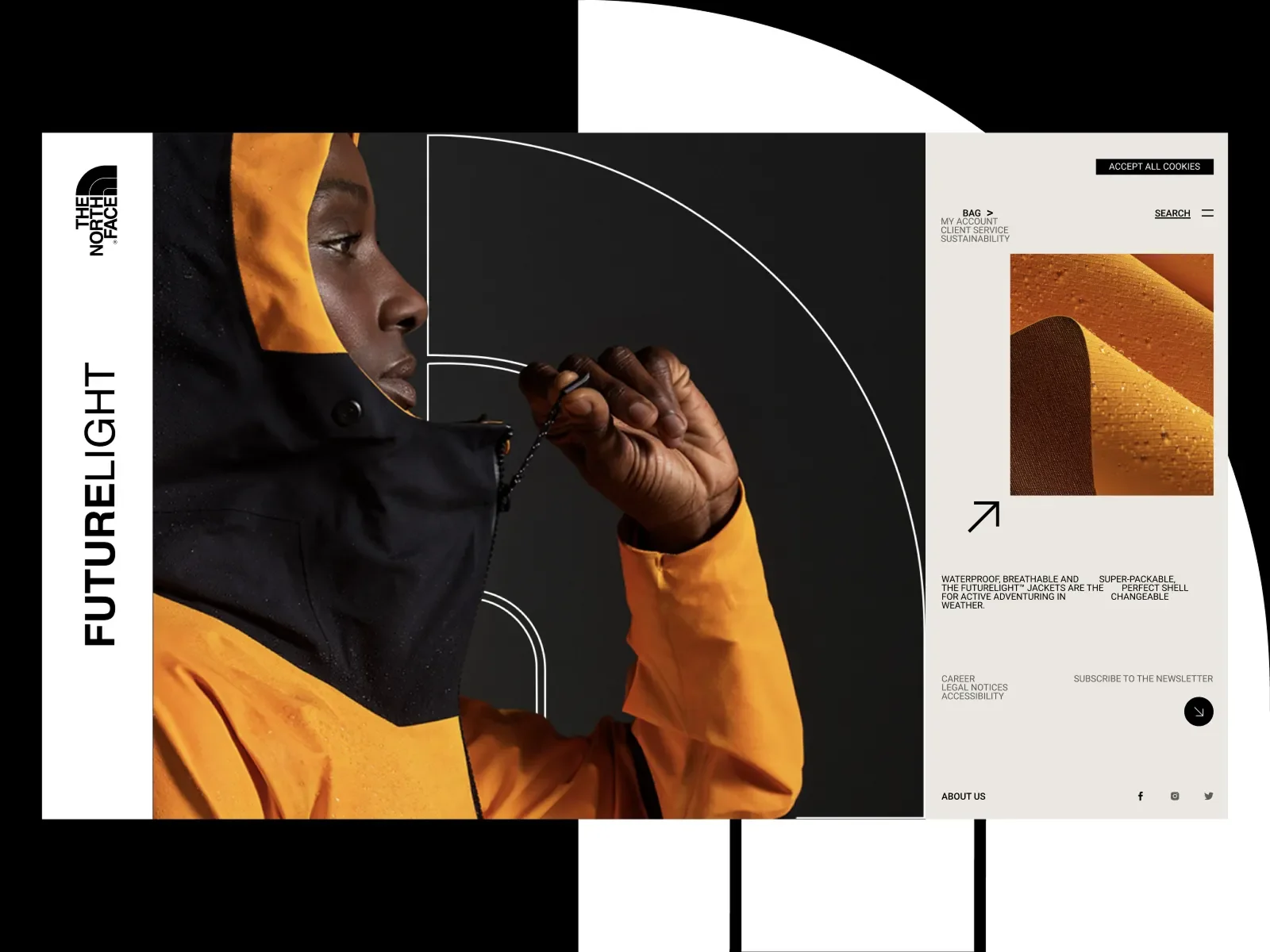
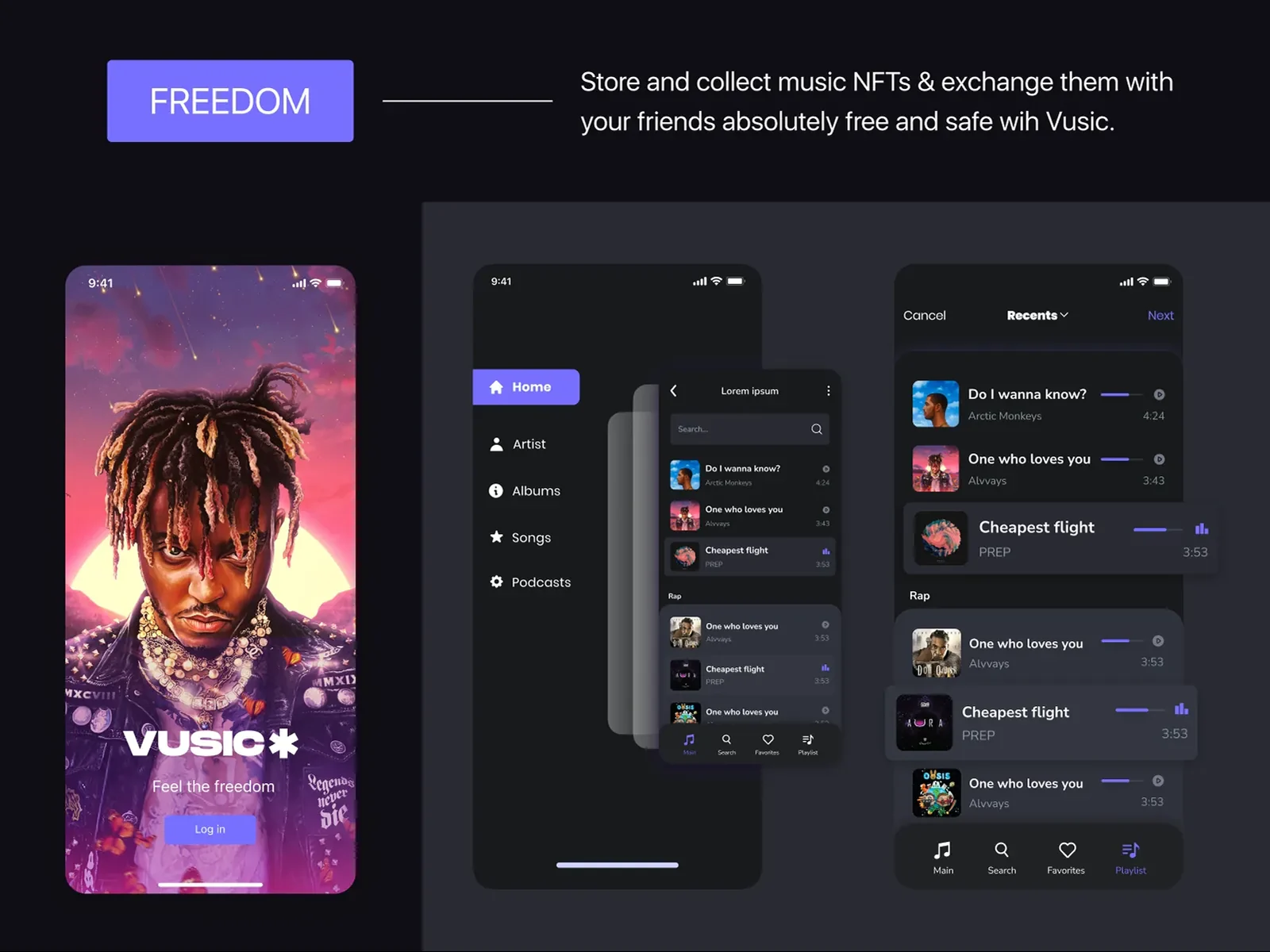
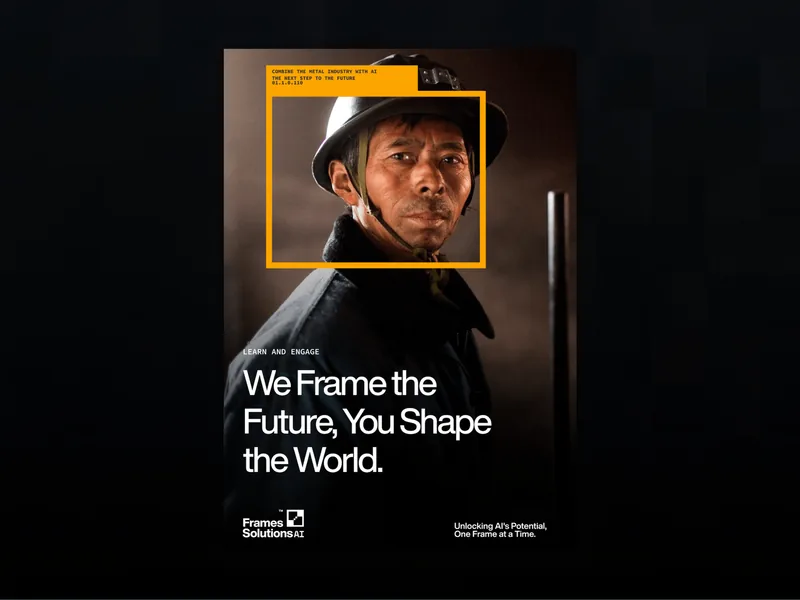
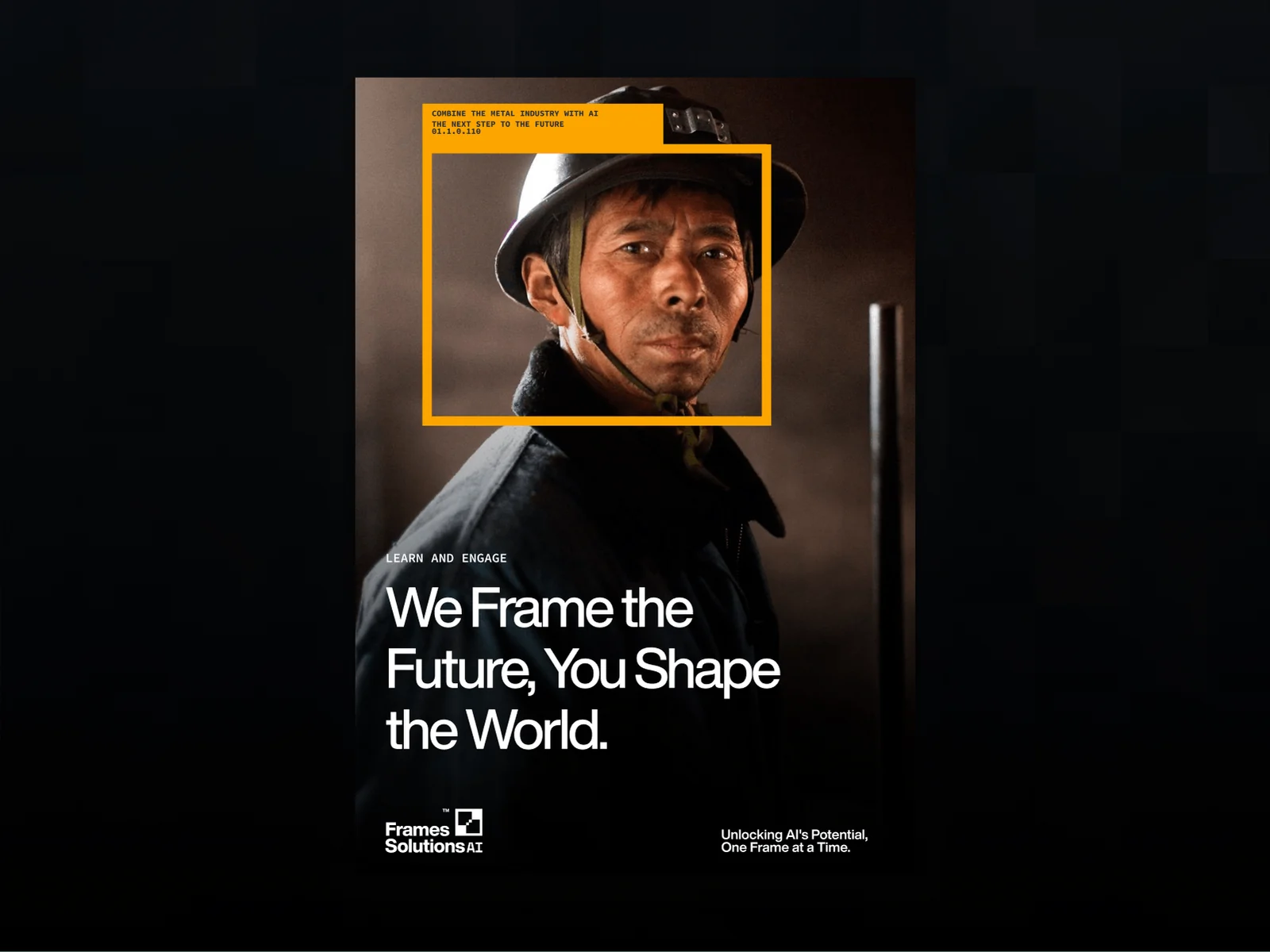
Google's Material Design guidance frames motion the same way: it should add expression while keeping the interface easy to use. You can see these principles in the product design for Frames Solutions AI and the landing page concept for The North Face.
Let the visual identity shape the behavior
A digital brand should not be limited to placing a logo and palette on standard components. Its character can appear in the scale of headings, the density of navigation, the rhythm of transitions, the way imagery enters, and the tone of small labels. These choices make the experience feel authored without making it harder to use.
The final test is simple: can a visitor move with confidence, and does the experience leave a specific impression? If only the first is true, the interface may be efficient but generic. If only the second is true, it may be expressive but demanding. The strongest work makes clarity and character feel like the same decision.
I design websites and product interfaces as part of my startup branding projects.
Launching a product? The startup branding checklist covers what the brand and interface need on day one, and tech startup branding covers AI and software products.

Rinor Rama — independent brand designer and creative director in New York with 13+ years of experience. Collaborations include Nike, Microsoft, Google, Brent Faiyaz and Don Toliver.Behance · Dribbble · LinkedIn
(Related work)
Seen in practice.




Tell me what you're building — I'd love to help.
Rinor RamaBrand designer & creative director
Contact