(In short)
- Recognition comes from a few repeatable signals, not more decoration
- Design the rule before the asset
- Test in ordinary places and measure with blank tests and branded search.
A useful identity is more than a collection of attractive assets. It is a repeatable way for a brand to become familiar without becoming predictable.
A brand is rarely experienced as a complete presentation. It arrives in fragments: a social post between two others, a package on a crowded shelf, a thumbnail in a search result, or a sentence at the top of a landing page. The work of identity design is to make those fragments feel related before the viewer has time to think about why.
What is brand recognition?
Brand recognition is how easily people identify a brand from its signals alone: a shape, a colour, a typeface, a way of speaking, without seeing the name. It is not the same as brand awareness. Awareness means people know a brand exists; recognition means they can pick it out in a crowded feed, on a shelf or from across the street. For a designer, recognition is the practical test of an identity. If a brand only works when the logo is large and centred, it isn't recognizable yet. It's decorated.
That is why recognition is a more useful goal than decoration. Decoration can make one touchpoint impressive. Recognition gives every touchpoint a role in the same story. It builds memory through decisions that can be repeated, adapted, and still remain specific to the brand.
Start with a small number of strong signals
The strongest systems usually have fewer ingredients than they appear to. A distinctive type relationship, a consistent image behavior, a clear rhythm, and one memorable graphic gesture can do more than a long library of unrelated effects. Each signal should survive outside the original layout and still feel intentional.
This does not mean making everything identical. Repetition without variation becomes wallpaper. A useful system defines what stays stable and what can move. The stable elements create recognition; the flexible elements keep the identity responsive to new messages, formats, and audiences.
Consistency is not the repetition of layouts. It is the repetition of intent.
Researchers at the Ehrenberg-Bass Institute call these cues distinctive brand assets: colours, shapes and other signals that bring a brand to mind without its name. It's harder than it sounds — Marketing Week reported research from Ipsos and JKR finding that only 15% of brand assets are truly distinctive.
Design the rule before the asset
When a project begins with individual assets, every new request can become a fresh design problem. When it begins with rules, the system starts making decisions with you. A rule might describe how headlines occupy space, how imagery is cropped, or how information changes scale across a page. Good rules are specific enough to create character and open enough to support unfamiliar situations.
This approach also makes collaboration easier. Writers, marketers, developers, and future designers do not need to imitate a finished composition. They can understand the principle behind it. The identity becomes a shared tool instead of a protected set of master files.
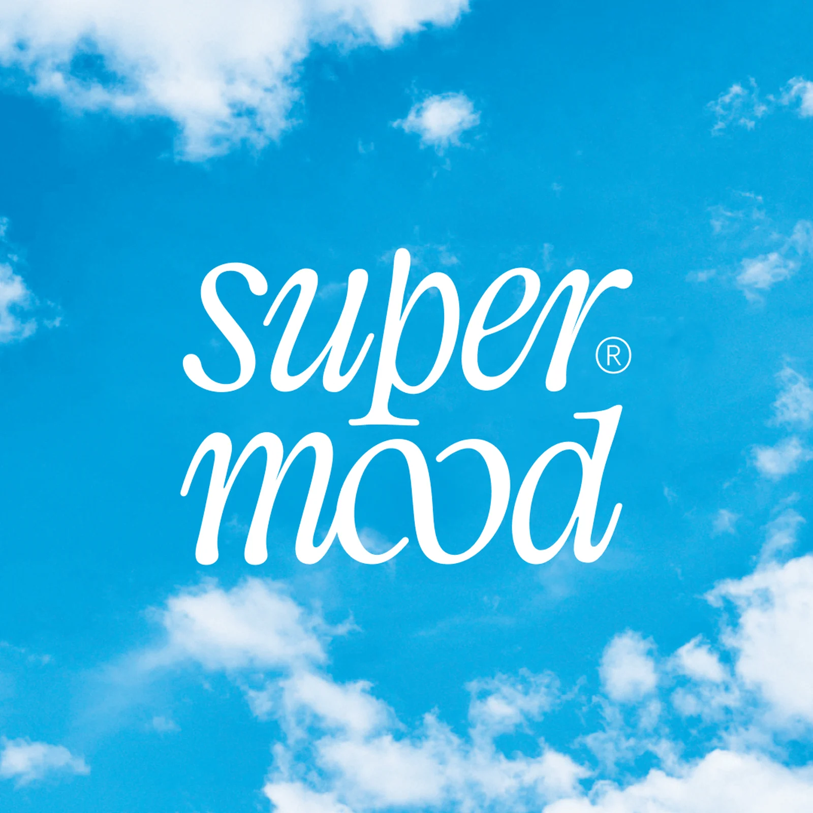
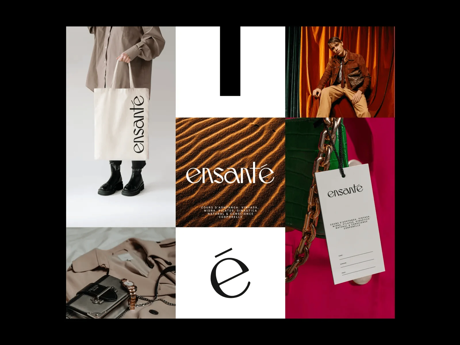
Those rules are what turn a logo into a brand identity system. You can see the approach in identity work for Seek and Supermood.
Test the system in ordinary places
Hero applications are useful for showing ambition, but ordinary applications reveal whether a system works. Test a long product name, a small mobile screen, a plain announcement, a dense presentation slide, and a low-resolution profile image. If the identity only feels distinctive when the format is generous, it is still an art direction concept rather than a complete system.
Recognition grows through many quiet encounters. The goal is not to make every one of them loud. It is to make each encounter feel like it could only come from the same source. When that happens, design stops behaving like surface treatment and starts becoming part of how the brand is remembered.
How to measure brand recognition
You don't need a research budget to get a useful signal. Run a blank test: hide the logo and name on a few real applications and ask people outside the team which brand it is. Track branded search in Google Search Console, because more people searching for your name is recognition showing up as behaviour. Notice how often partners, press and customers reproduce your signals correctly without the guidelines in front of them. And review your own touchpoints every few months: if a social post, an invoice and a landing page could belong to three different companies, recognition is leaking.
Designing identities that hold up everywhere is the core of my brand identity design work.
A free brand audit gives you a quick outside view of the same question.

Rinor Rama — independent brand designer and creative director in New York with 13+ years of experience. Collaborations include Nike, Microsoft, Google, Brent Faiyaz and Don Toliver.Behance · Dribbble · LinkedIn
(Related work)
Seen in practice.








Tell me what you're building — I'd love to help.
Rinor RamaBrand designer & creative director
Contact